Case study / 01
NAMI
TENTOU
Promotional graphics and animation for a game studio.
Context
NAMI TENTOU needed promotional material that made retro-inspired games feel immediate across social campaigns and storefronts — each piece keeping its game's visual character while reading fast at small scale.
Constraint
Gameplay had to be shown at a fixed, small size to keep the device visible — a client and brand-guideline requirement, not a design choice. It shaped composition, hierarchy, and motion throughout.
Process
Make the game world legible before the details.
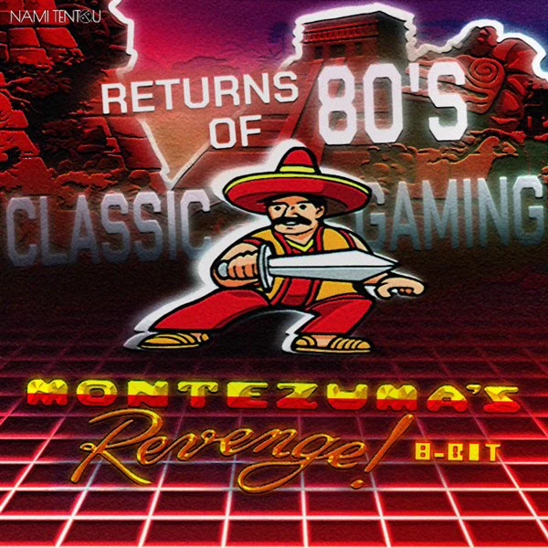
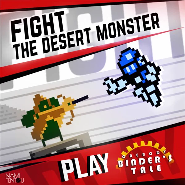
Each piece starts with a single recognisable image and a clear message. Bold titles, strong diagonals, and high-contrast character silhouettes create a reading order that works before the viewer reaches the gameplay frame.
Key decision
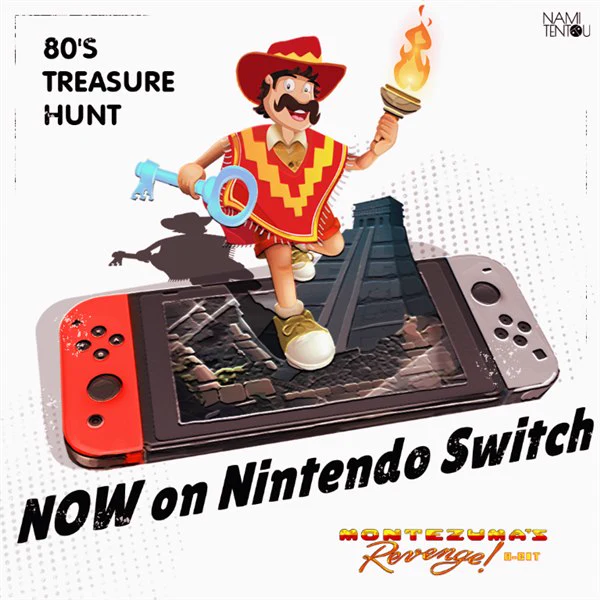
Rather than filling the layout with a large gameplay capture, I used the required device frame as part of the story. It grounds the release message while the character, title, and campaign line carry the first read.
Outcome
Campaign motion for distinct game worlds.
Square loops for social campaigns.